
End-to-end product and brand design for a multi-role compliance SaaS platform built for structured, secure data management.
As Covea’s digital portfolio expanded, there was a growing need for a centralised, scalable design system. Alongside creating the GoSure brand from scratch, I focused on establishing the design foundations that would support multiple customer-facing products and internal tools. The aim was to create a flexible, mobile-first system that could evolve with the business while improving alignment between design and development teams.
Covea Insurance plc
2020–2023
Senior UI Designer
Design efforts across products were fragmented, with duplicated components and inconsistent UI patterns. Designers and developers were working without a shared source of truth, which slowed delivery and made scaling difficult.
The system needed to support multiple brands and product types while remaining adaptable, not overly rigid. At the same time, it had to align with the newly established GoSure visual identity and support future digital initiatives.
I led the design-side foundations of the system, building the core UI toolkit in Figma and defining how components should behave, scale, and be governed.
I worked closely with developers as components were translated into a React Storybook library, ensuring the design intent was accurately reflected in implementation. I also contributed to documentation, naming conventions, and governance processes to create a shared language between teams.
Design system decision flowchart and governance framework
The design system was built on the visual and structural principles established through the GoSure brand. Having defined the brand from the ground up - including its visual language, typography, and tone - I was able to embed those foundations directly into the component architecture.
Rather than creating a rigid library, I focused on modular, reusable components supported by clear rules and hierarchy. Foundational tokens such as colour, typography, and spacing were defined early, providing consistency across interfaces. Core UI components were structured with variants and usage guidance to support different product contexts.
Close collaboration with developers ensured that the Figma toolkit translated effectively into React components within Storybook. Regular reviews and workshops supported adoption and helped refine the system as it matured.
Voice input UI examples and interaction patterns for insurance applications
Address input component variations showing different states and implementations
The system introduced greater consistency across digital products and reduced duplication between teams. By aligning the design foundations with the GoSure brand and supporting their translation into React, we created a stronger bridge between design and engineering.
The experience reinforced how important governance, shared language, and cross-team collaboration are when building systems within enterprise environments. A design system is not just a toolkit, it’s an operational shift in how teams work.
End-to-end product and brand design for a multi-role compliance SaaS platform built for structured, secure data management.
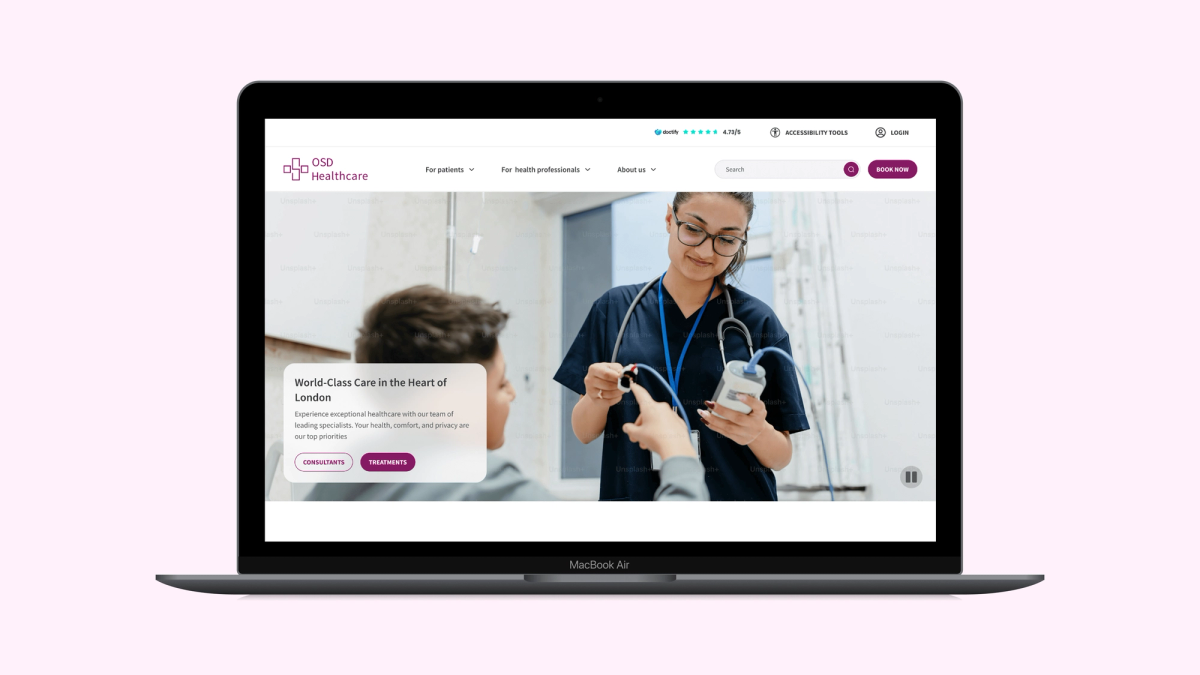
UX and UI redesign of a healthcare website, focused on improving accessibility, navigation, and clarity across complex medical content.

A bold new mobile-first brand built from scratch to unify digital products and spark innovation across Covea’s platforms.
Have a project in mind? I'm available for new opportunities and love designing thoughtful, user-friendly digital products, whether it's UX/UI for web and mobile apps, SaaS platforms, or something new.
Get in touch